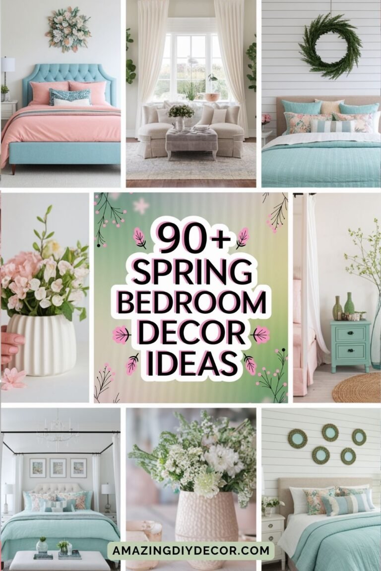
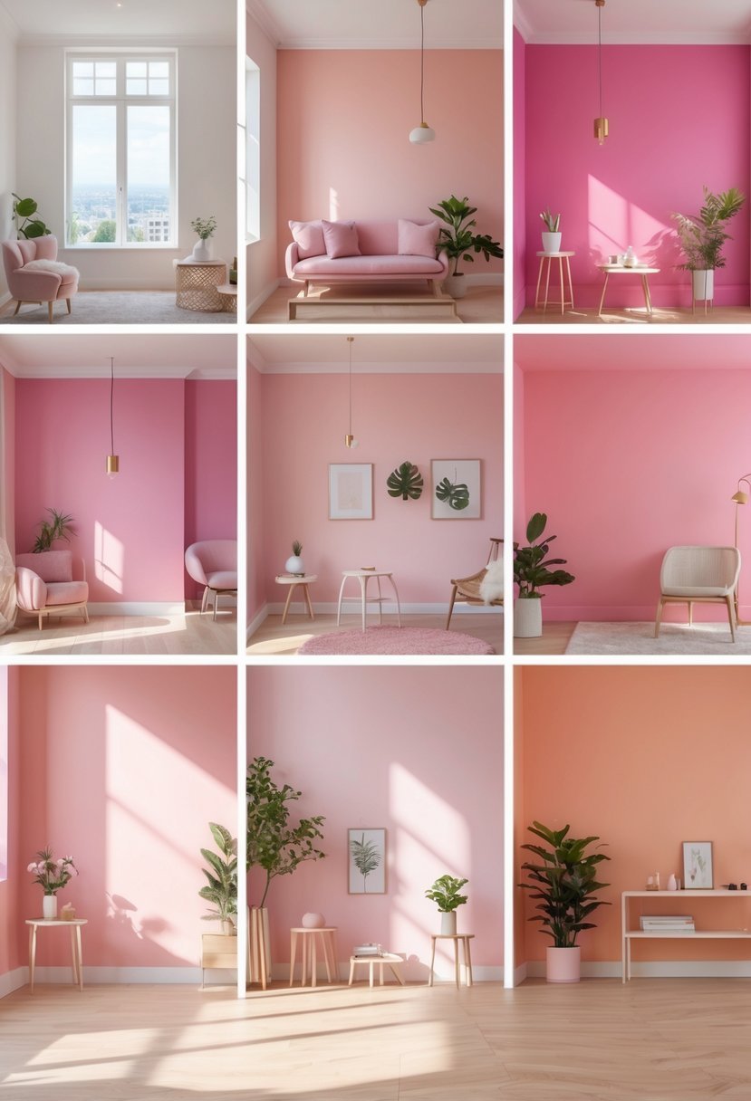
10 Pink Paint Colors For Walls Ideas Perfect For Every Room
Is Pink the New Neutral? Why This Versatile Hue Belongs on Your Walls. Gone are the days when pink paint was reserved strictly for nurseries or bubblegum-themed bedrooms. Today, pink has re-emerged as a sophisticated, warm, and surprisingly versatile choice for modern interiors. From barely-there blush tones that act as calming neutrals to deep, earthy terracottas that add drama and depth, there is a shade of pink to suit every design aesthetic.
However, finding that perfect hue can be tricky. Lean too far one way, and it looks too sweet; lean too far the other, and it clashes with your furniture. The secret lies in understanding undertones and lighting. To help you navigate the sea of swatches, we’ve curated a list of the most stunning pink paint colors for walls. Whether you are looking to create a cozy reading nook or a chic dining area, these shades will prove just how grown-up pink can be.
Choosing the right pink paint color can transform a room’s atmosphere, whether you want something soft and subtle or bold and vibrant. I’ve gathered ideas that help you see how different shades of pink can bring warmth, charm, and personality to your walls.
The key is knowing which pink tones work best for your space and style, balancing color with furniture and lighting. With the right choices, pink paint can suit various rooms and moods, making it an exciting option for home design.
Table of Contents
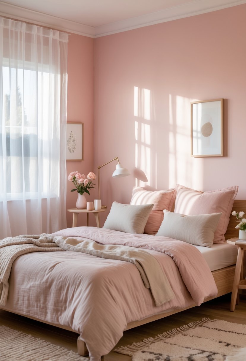
1) Soft Blush Pink for a subtle, calming atmosphere
I find soft blush pink to be an excellent choice for creating a subtle and calming atmosphere in any room. Its gentle hue brings warmth without overwhelming the space.
This shade works particularly well in bedrooms or living areas where relaxation is key. It pairs easily with neutral tones like creams and soft grays, enhancing a sense of tranquility.
Using a flat or eggshell finish enhances the softness of blush pink on walls. It keeps the look peaceful and inviting, perfect for spaces meant to refresh the mind.
2) Dusty Rose to add warmth and vintage charm
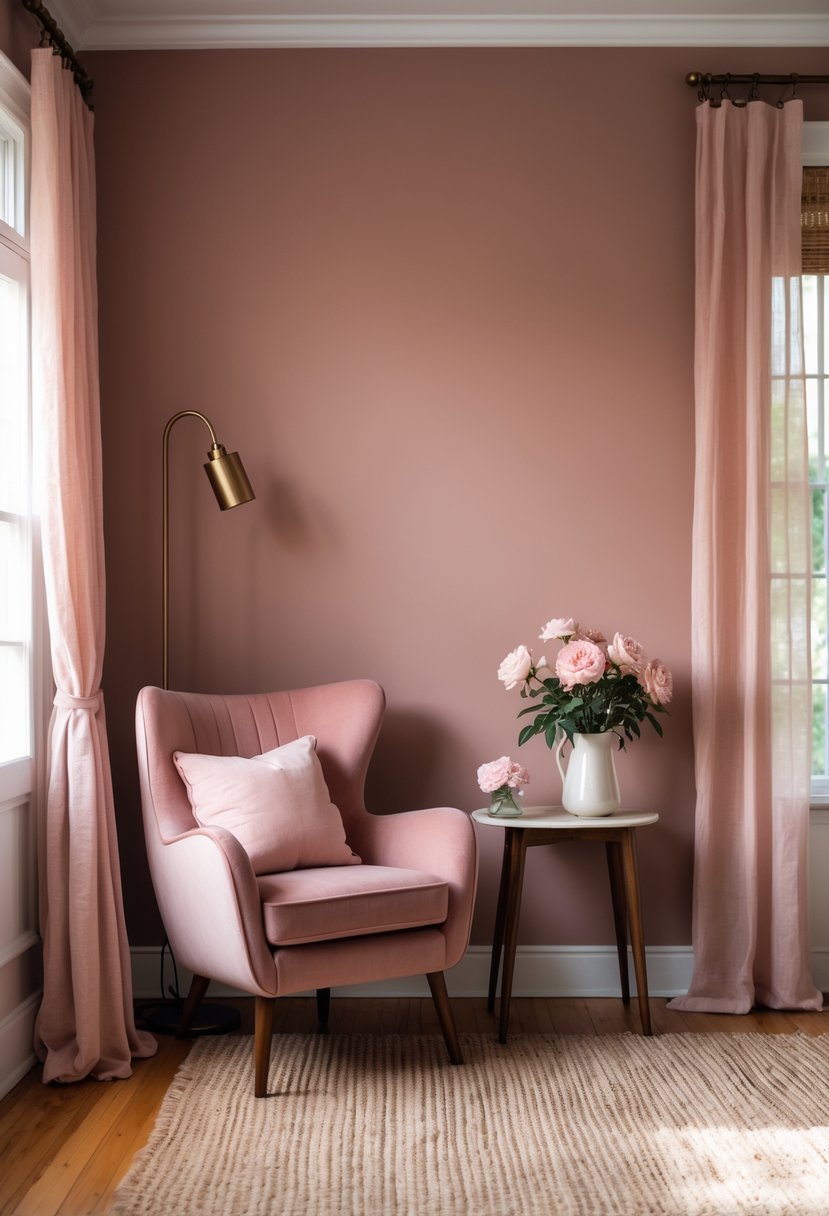
I find dusty rose to be one of the most versatile pinks for walls. Its muted, soft tone carries just enough warmth to make a room feel inviting without overwhelming the space.
This color has a subtle vintage appeal that adds an elegant, timeless quality. I often recommend it for creating cozy, intimate rooms that balance calmness with character.
Dusty rose works well alongside creams, deep blues, and earthy tones, making it easy to coordinate with various decor styles.
3) Bold Magenta for a playful and energetic space
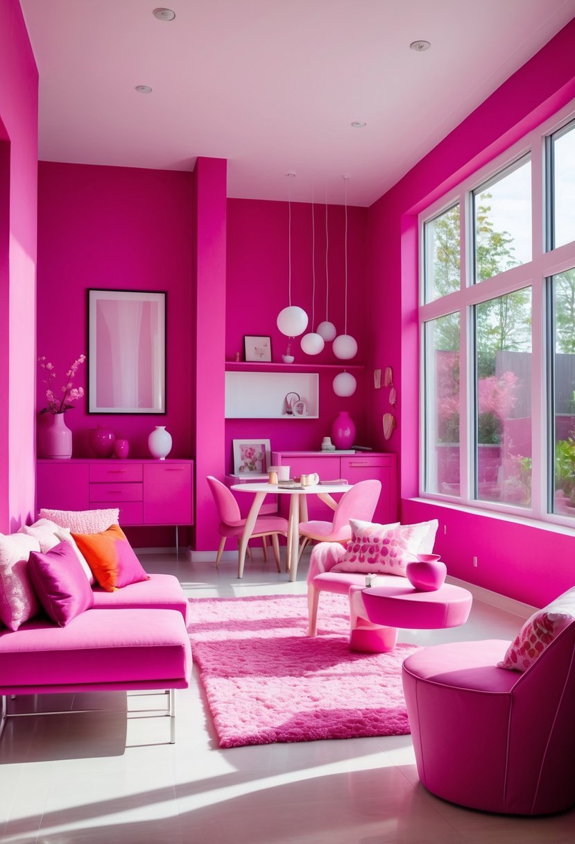
I choose bold magenta when I want to add energy and fun to a room. This shade creates a vibrant atmosphere without overwhelming the space.
Magenta walls work well in kids’ rooms or creative areas because the color encourages imagination. Pairing magenta with neutral furniture helps balance its intensity.
I also find magenta accents effective for those who prefer a softer impact. Whether on one wall or through accessories, bold magenta refreshes a room with personality and life.
4) Rose Quartz for a modern, trendy look
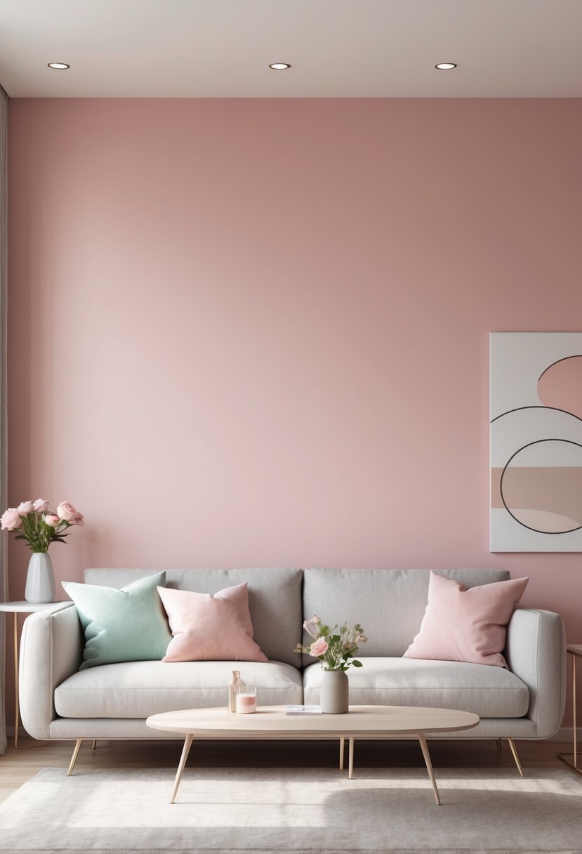
I find rose quartz to be an excellent choice for a modern and trendy space. Its soft pink hue brings warmth without overwhelming the room.
The color feels fresh yet calming, making it ideal for living rooms or bedrooms. Rose quartz pairs well with minimalist designs and subtle neutrals like gray or white.
It adds a touch of personality while maintaining a clean, sophisticated feel. I also appreciate how versatile it is—this shade works in both natural and artificial light.
For those wanting a stylish update, rose quartz offers a subtle, elegant pop of color.
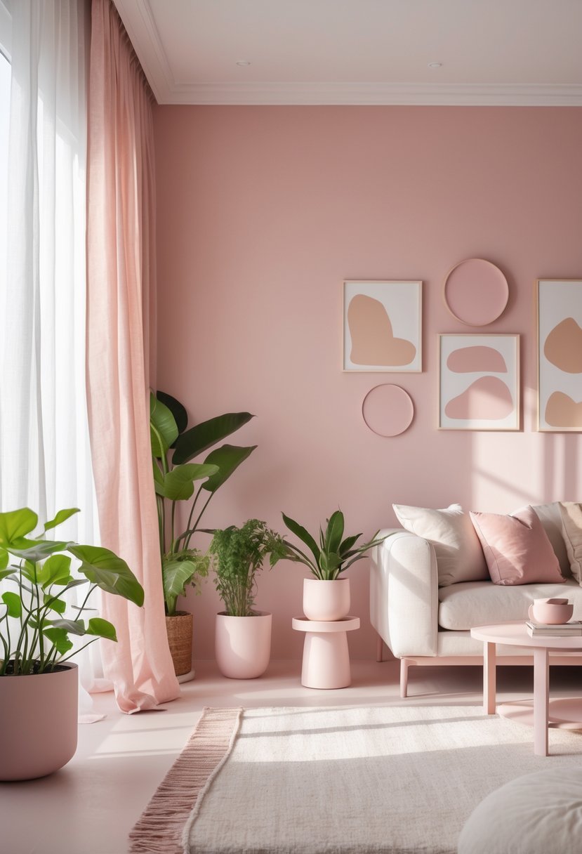
5) Blush Pink paired with white trim for elegance
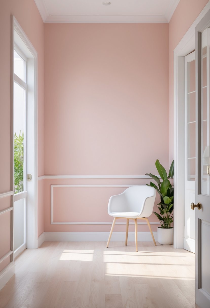
I find that blush pink walls combined with crisp white trim create a timeless, elegant look. The white trim adds definition and contrast, keeping the space fresh and modern.
This combination works well because the softness of the blush pink is balanced by the clean lines of white. It highlights architectural details without overwhelming the room.
In my experience, using white trim with blush walls adds a subtle sophistication. It’s versatile enough for bedrooms, living rooms, or even dining areas.
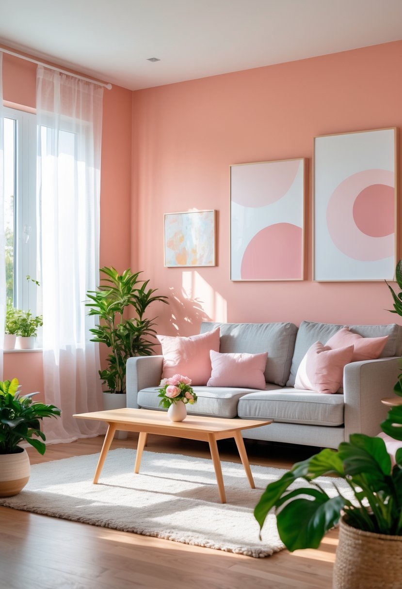
6) Coral Pink to brighten kitchens and dining areas
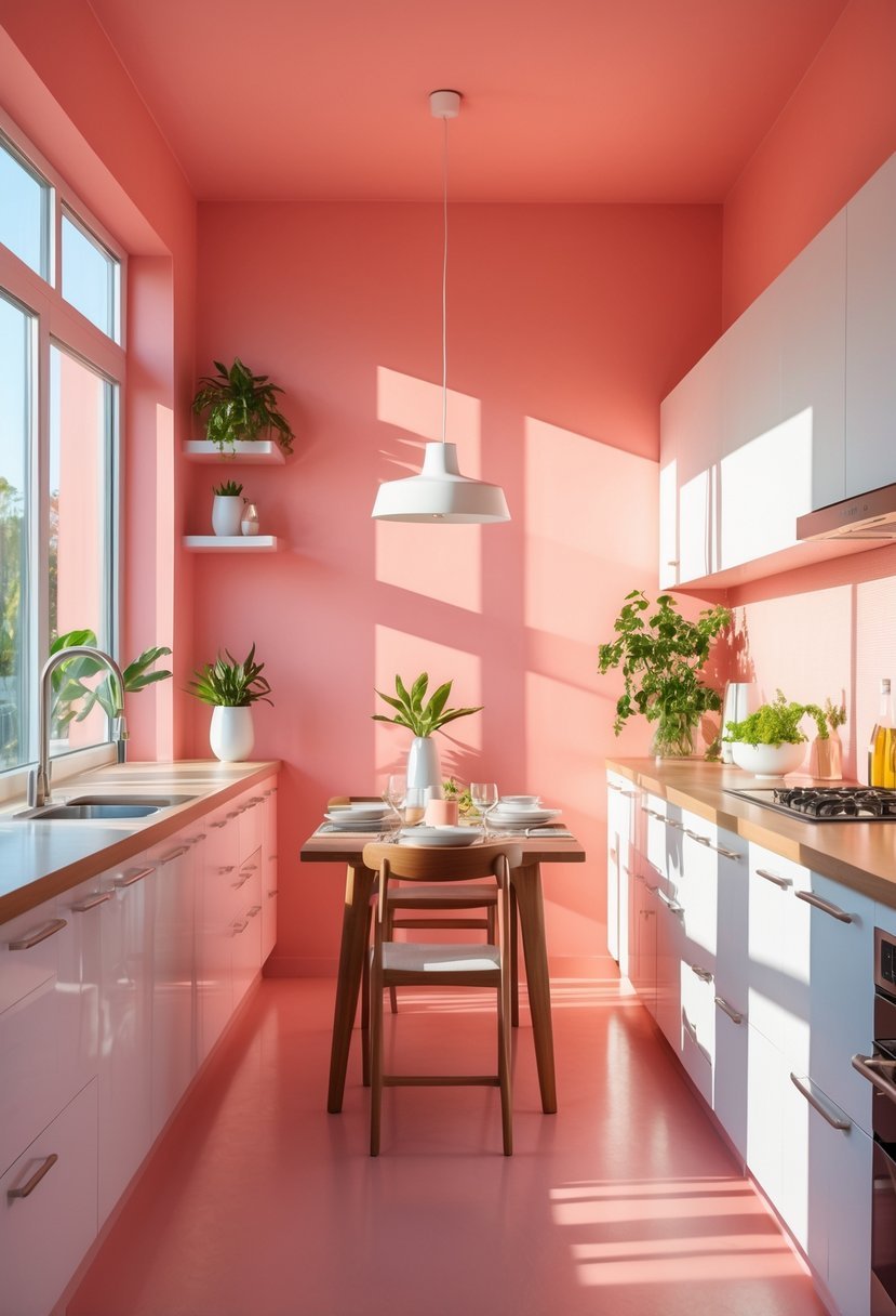
I find coral pink to be a lively choice for kitchens and dining spaces. It blends pink and orange tones, adding a warm and inviting atmosphere without being overwhelming.
Coral pink works well as an accent or primary wall color. It pairs nicely with neutral shades like white or beige to maintain balance and avoid visual clutter.
In my experience, coral pink can energize a space while still feeling cozy.
7) Muted Pink with gray accents for a sophisticated vibe
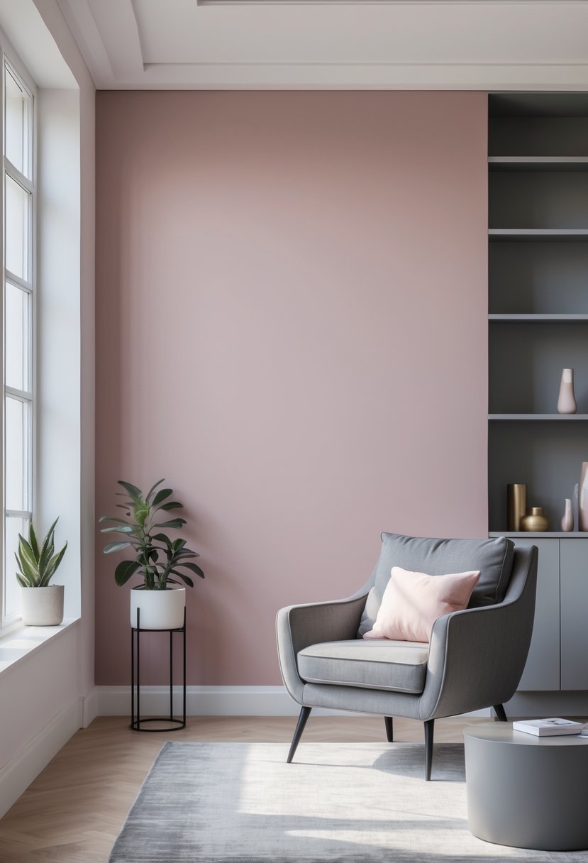
I find muted pink paired with gray creates a balanced and refined atmosphere. The softness of the pink adds warmth without overwhelming the space.
Gray, acting as a neutral base, grounds the room and enhances the pink accents. Using muted pink on walls allows for subtle color that feels elegant and calming.
I like to combine this with gray furniture or decorative pieces to keep the look contemporary. The contrast between the two colors brings depth without feeling heavy or dull.
This palette works well in bedrooms and living rooms when you want sophistication with a touch of softness.
8) Peony Pink to create a cozy bedroom retreat
I find Peony Pink to be an excellent choice for fostering warmth and comfort in a bedroom. Its soft, slightly muted tone brings a sense of calm without feeling overly sweet or juvenile.
This shade pairs well with neutral furnishings or natural wood accents, making the space inviting and balanced. I’ve noticed that Peony Pink helps soften the atmosphere, encouraging relaxation at the end of a busy day.
Using Peony Pink on your walls creates a cozy retreat that remains sophisticated.
9) Salmon Pink to enliven living rooms
I find salmon pink is an excellent choice when you want to add warmth without overwhelming a living room. Its blend of pink and orange creates a cozy, inviting atmosphere that feels both modern and timeless.
Pairing salmon pink with earthy tones or muted neutrals can balance its vibrancy. I often recommend using it on an accent wall to enliven the space without making it too bold.
This color works well in different lighting conditions, maintaining softness in natural light and becoming richer in artificial light. For me, salmon pink offers versatility and subtle energy, perfect for a welcoming living area.
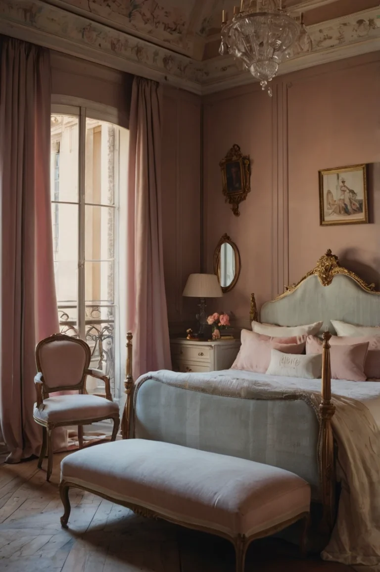
10) Warm Pink with gold finishes for a luxurious touch
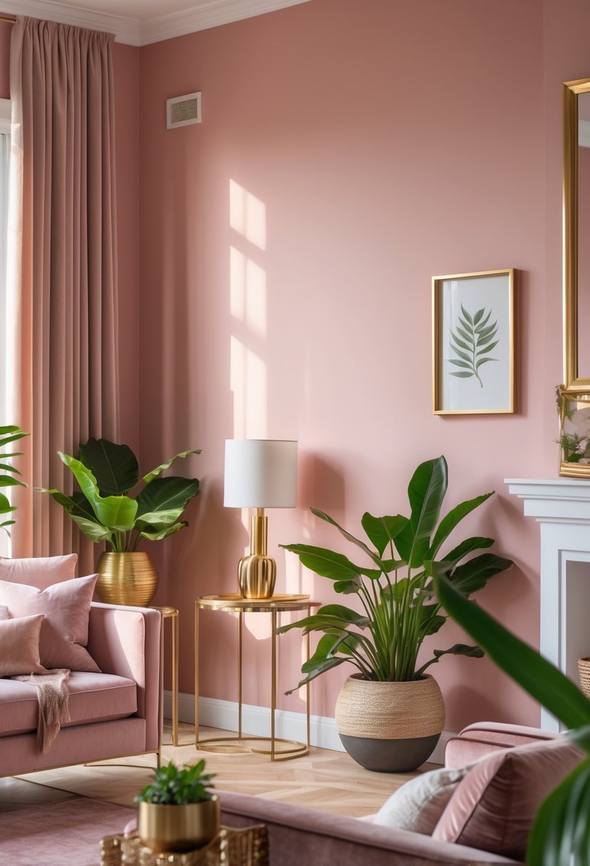
Warm pink walls paired with gold finishes create a subtle yet rich atmosphere. The warmth of the pink adds softness, while gold accents introduce a refined and elegant feel.
This combination works well in living rooms or bedrooms. Gold hardware, picture frames, or light fixtures against a warm pink backdrop bring depth without overwhelming the space.
Using warm pink with gold also allows for easy coordination with neutral tones like beige or greige.
Conclusion
Finding Your Perfect Shade of Pink
As you can see, painting your walls pink doesn’t mean you have to commit to a bright, neon aesthetic (unless you want to!). The world of pink paint offers an incredible range of moods, from the serenity of dusty rose to the high energy of vibrant coral.
Before you pick up a roller, remember the golden rule of painting: test your swatches. Pink is notoriously sensitive to lighting conditions. A shade that looks like a soft beige in the morning sun might turn into a bright salmon under your evening lamps. Paint large squares on different walls and watch how the color evolves throughout the day to ensure you love it in every light.
We hope this list has inspired you to take the plunge and embrace the warmth and personality that pink brings to a home. Happy painting!